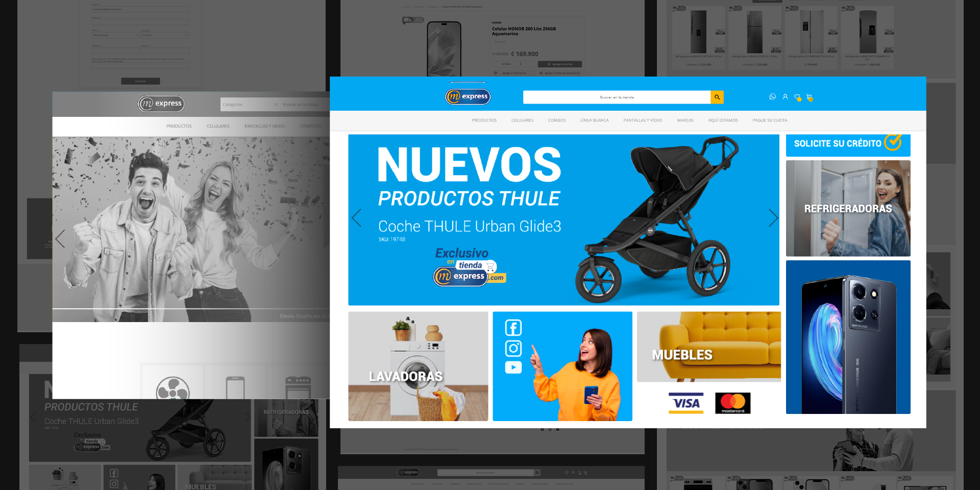
In mid-2024, the Costa Rican e-commerce company MExpress decided to update its website’s image to modernize its appearance and enhance functionality and usability.

A key starting point for the project was conducting a functionality audit of the existing site. Through detailed analysis and navigation, several areas for improvement were identified, including the search bar functionality, visual content organization, a refreshed contemporary design, and an easier, more intuitive checkout process. Based on these findings, a new design solution was proposed to address these needs effectively.

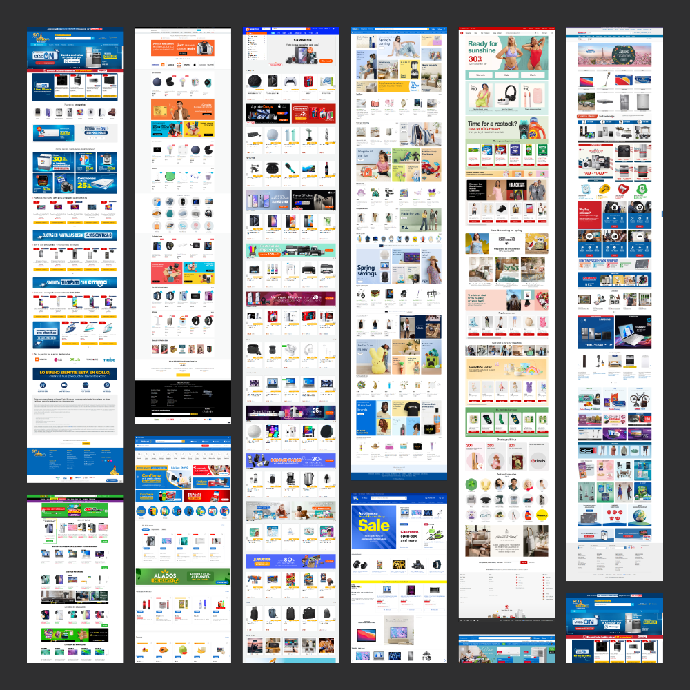
With the client’s needs and site challenges clearly defined, the next step involved researching references. The research focused on leading retailers in Costa Rica, Central America, and globally, such as Walmart, Target, and Best Buy. These companies were prioritized as benchmarks due to their extensive customer base and retail expertise.
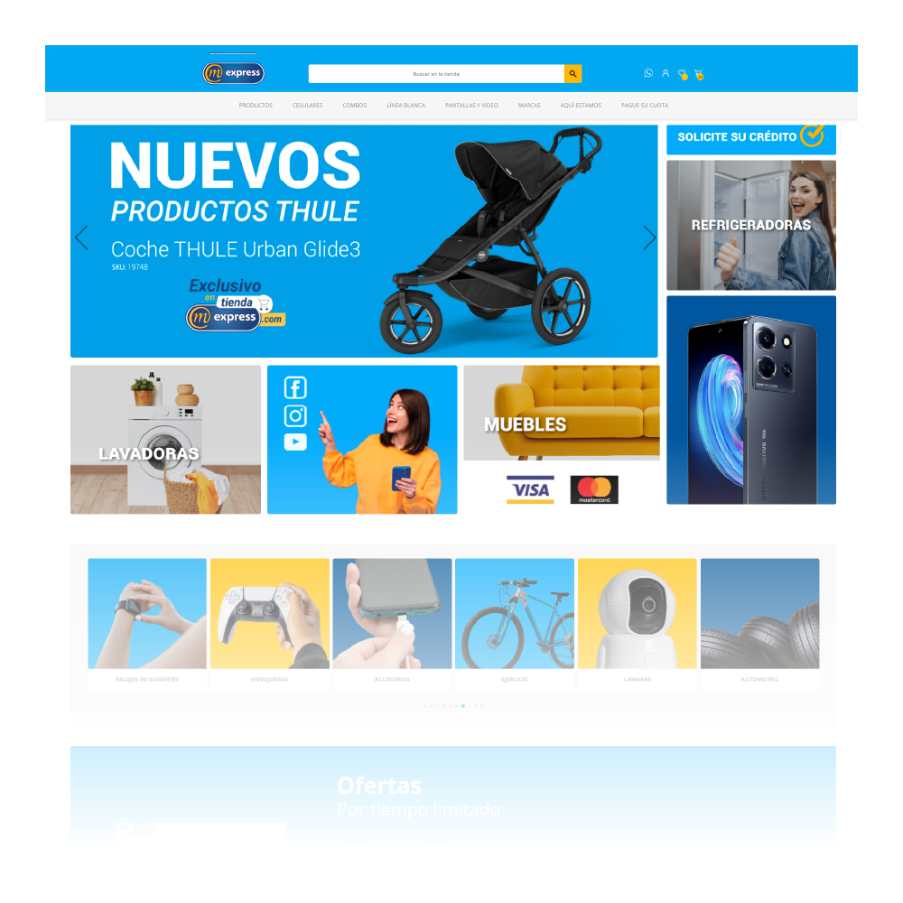
One of the client’s primary requests was to revamp the main banner section to allow more customization and control over the content. The proposed solution introduced a grid-based design, enabling the client to showcase multiple attention-grabbing elements on the homepage. This improved the site’s dynamism and significantly enhanced its customization potential.
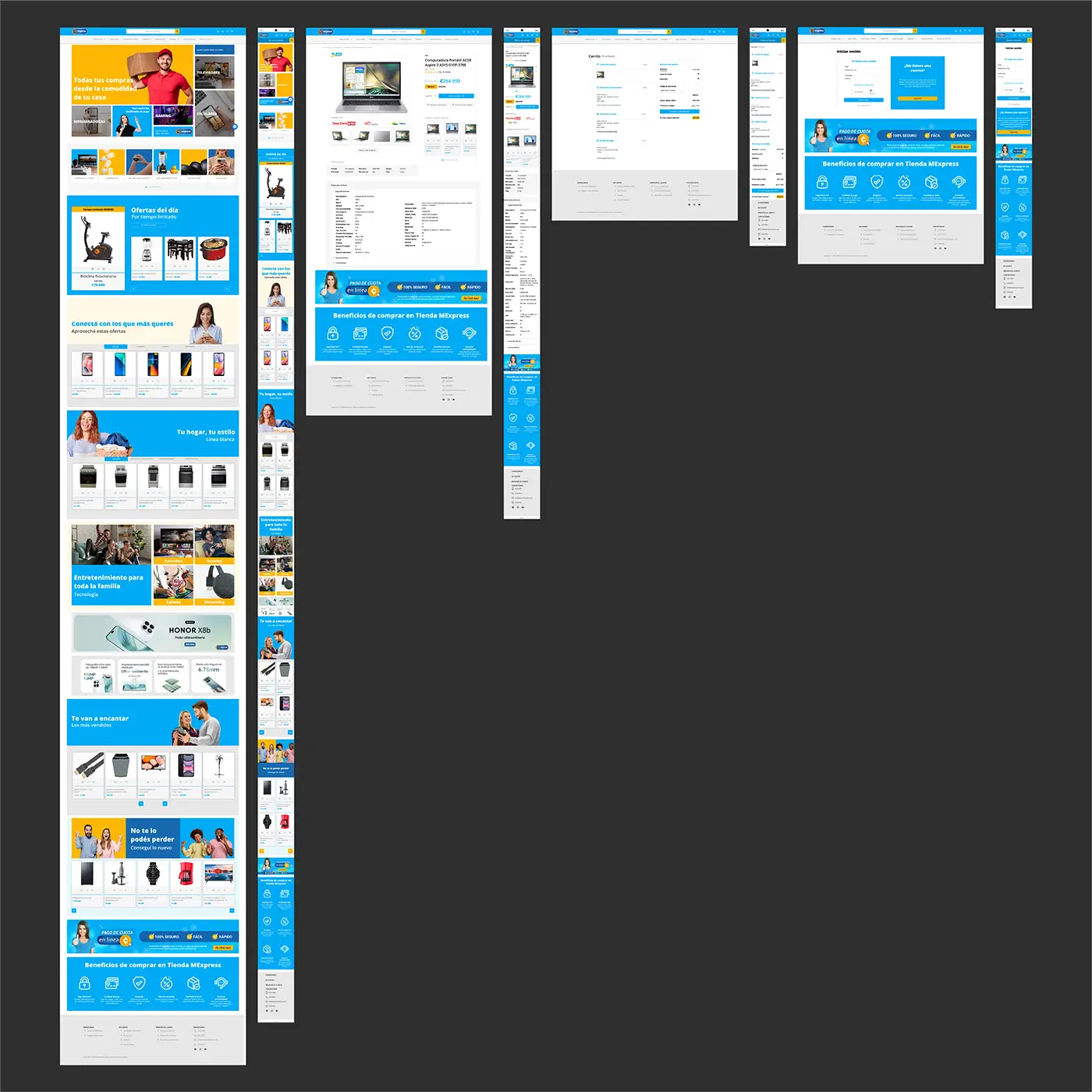
To improve storytelling, banners with emotionally resonant messages were integrated into the featured product sections. This approach aimed to create a more personal connection with users and strengthen brand loyalty by fostering a sense of belonging.
Maintaining consistency in color usage and imagery was a key visual priority during the redesign. For this reason, product category icons were replaced with images. This change brought the interface closer to the user, aligning with the site’s predominantly image-based aesthetic and ensuring visual harmony throughout.
Improving the checkout experience was a critical client requirement. A notable pain point identified was the disorganized information layout, which required excessive scrolling to navigate. The new proposal addressed this by organizing the information into focused sections, presenting one required field at a time, and streamlining the purchase process to enhance user satisfaction.

The final prototype is formed by the homepage, product page, checkout, and login sections, delivering a comprehensive design solution that addressed the client’s needs.
Collaborating with designers from other teams and developers was an invaluable experience. I gained firsthand insight into the importance of effective communication and had the opportunity to coordinate collaborative work sessions between all parties involved.
Extend the new design language to the remaining pages of the website.
Gather additional user feedback to identify future improvements that enhance the site’s usability and accessibility.