This project involved redesigning the e-commerce system for the Dos Pinos dairy Cooperative, Costa Rica’s largest dairy producer, with a strong presence throughout Central America.
The goal was to expand the product portfolio available to consumers while refreshing the visual identity to better align with the brand’s values.
The redesign also focused on enhancing the functionality of existing features from the previous design, ensuring a more intuitive and user-friendly experience.
The redesigned application was successfully launched in the second half of 2024.
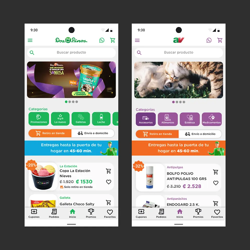
The client is a company that caters to both human food products and animal welfare supplies, the project required redesigning an existing e-commerce platform to seamlessly integrate both product categories into a single platform.
As part of the request the client needs to allow users to clearly distinguish between the two product families, keeping them in separate stores while ensuring shoppers can easily navigate between them.
To redesign a seamless integration of both product categories, allowing for clear differentiation and easy navigation.
Additionally, the project sought to refresh the app’s look and feel, enhancing the overall user experience and making it simple for users to switch between the two stores.
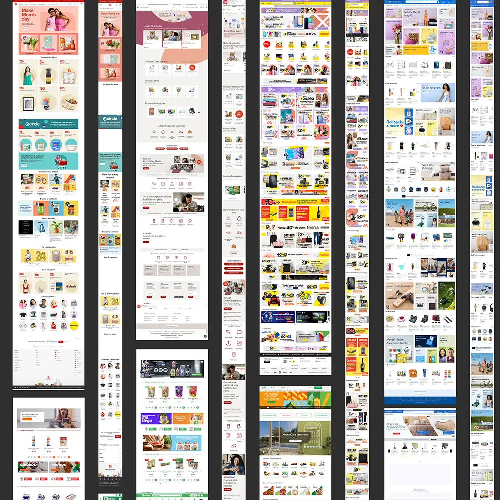
During the benchmarking stage, we reviewed both direct and indirect competitors of Dos Pinos. This involved analyzing retail websites and apps from Costa Rica, Latin America, and the United States to identify strengths and potential areas for improvement in design. The insights gathered from this analysis informed our design strategy, ensuring that the final product was competitive and aligned with industry best practices.

I’m María González, a 38-year-old working mom with two kids, juggling a busy life while staying loyal to Dos Pinos for their delicious products. I’ve started exploring online shopping to save time, but I need assurance that the online store is easy to use and dependable.

I’m Carlos Ramírez, a 46-year-old father and pet owner juggling the needs of my family and our dog. With a busy schedule, while I appreciate the time savings and convenience of delivery, I’m cautious about potential issues like incorrect orders or hidden fees.
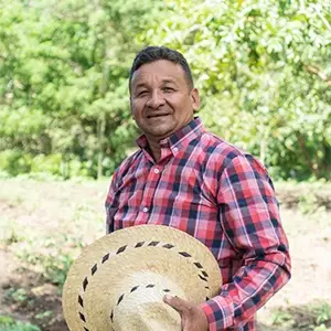
I’m José Hernández, a 55-year-old farmer. Although I’m less familiar with online shopping, I see its potential to save me time and offer a wider selection of products. However, I’m cautious about ordering online due to concerns about product suitability and the complexity of the process.
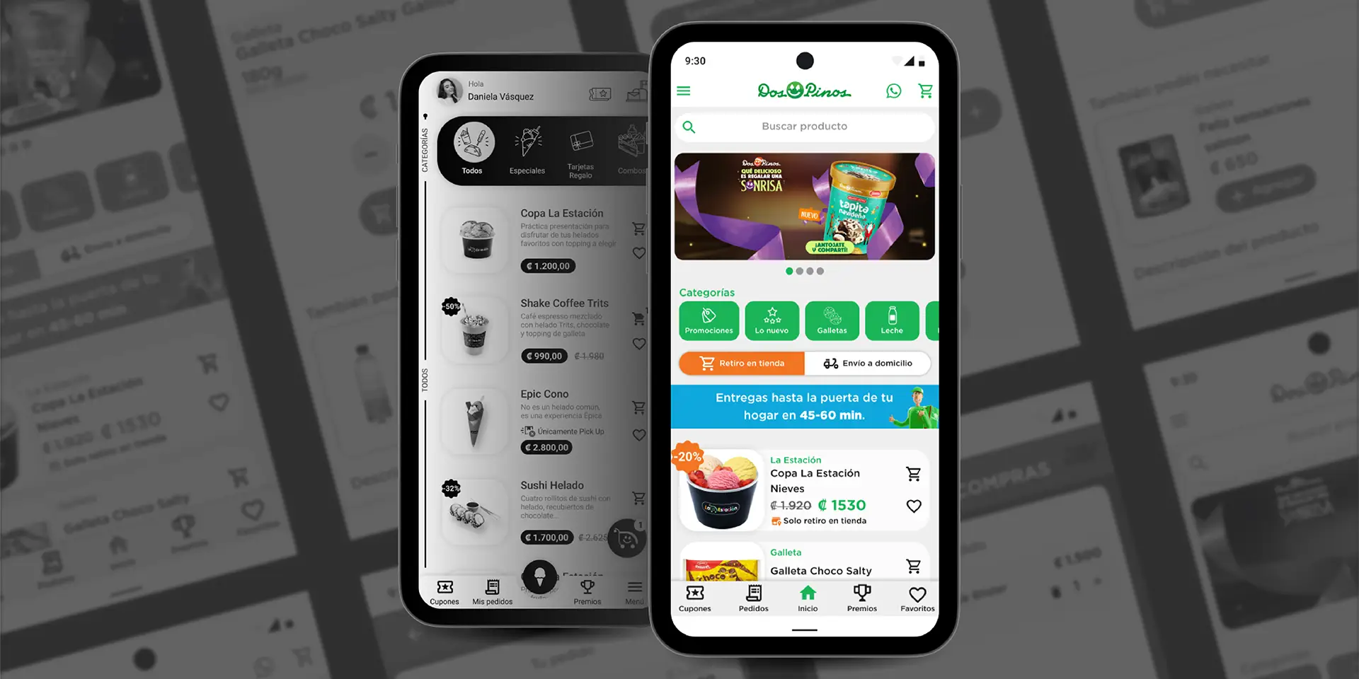
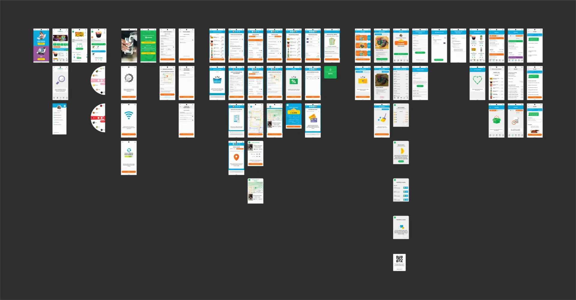
For the app’s initial version, a Minimum Viable Experience (MVE) was created to enable stakeholders and users to test the proposed solution and provide valuable feedback. This version primarily focused on recoloring and making basic adjustments to existing elements. Insights from this feedback were incorporated into an iterative workflow, allowing for continuous refinement and enhancement, which ultimately led to the final design.
User Interface Redesign: Revamped the user interface to make it more intuitive and user-friendly.
Improved Text Legibility: Increased font sizes to enhance readability across the platform.
Product Card Reorganization: Reorganized the product card layout to better communicate key product attributes.
Enhanced User Experience: Improved usability by adding a search bar and clearly defined product categories.
Carousel and Category Redesign: Redesigned the product carousel and categories to accurately reflect the full product portfolio.
User Interface Reorganization: Reorganized elements and improved the user interface to enhance the overall user experience.
Button and Graphic Element Redesign: Increased the size and redesigned buttons and graphical elements to make them more prominent and user-friendly.
Product Page Overhaul: Completely revamped the product page design to include traditional e-commerce elements, such as detailed product information and related products for cross-selling opportunities.
Streamlined Checkout Process: Simplified the entire checkout process to make it more intuitive and user-friendly.
Element Reorganization: Reorganized checkout elements to enhance intuitiveness and improve the overall user experience.
User Experience Enhancements: Introduced quality-of-life improvements, including contextual elements that assist decision-making and facilitate a smoother checkout process.
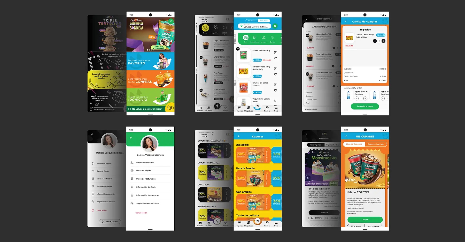
Users can effortlessly differentiate between the two stores and product lines, with the design incorporating distinct color schemes that align with each brand’s guidelines. This approach ensures a clear separation between the two while maintaining a seamless and intuitive user experience.
The final design includes all the essential sections for the prototype, such as a complete and intuitive checkout process, user profile management, and interfaces for login and account registration. It also integrates features like coupons and a loyalty program to enhance user engagement, along with informative empty-state messages to guide users when a page lacks content. Together, these elements create a comprehensive and user-friendly experience aligned with the project’s goals.
Through this project, Dos Pinos gained a unified platform that redirects buyers to a single, streamlined system, enabling them to purchase their favorite Dos Pinos products quickly, easily, and efficiently.
As of today, the app has achieved over 10,000 downloads on the Google Play Store, reflecting its positive reception and growing user base.
This project allowed me to enhance my skills in visual design and prototyping. Additionally, collaborating closely with stakeholders through working and review sessions helped me improve my ability to understand their needs and effectively present projects. These experiences have strengthened both my technical and communication skills as a UX designer.
Continuously improving the app based on user feedback to better meet their needs and expectations.
Expanding my knowledge of accessible design principles to ensure the next iteration of the app is more inclusive for all users.